
Learn more about the analytics behind your Inphlu account and the content that you create, share with others, and publish to your connected social media accounts.
Summary
The Dashboards are a compilation of your analytics both on and off of Inphlu. This means that the Dashboards is the place to learn more about your account's analytics on Inphlu and the accounts you use Inphlu to publish content to. The Dashboards tab can be broken down into five separate sections:
- My Analytics
- Social Media Analytics
- Company Analytics (if you're an Enterprise Admin or related role)
- Shared Post Analytics
- Shortened URL Analytics
My Analytics

The My Analytics section is an overview of your Inphlu account's analytics and its performance. My Analytics is made up of the following: Total Counts, Posts by Status, Posts by Tag, Posts by Platform, and Storyboard Analytics. All of these analytics and charts, they pull and display data for the current month. After the current month passes, you'll notice many of these analytics reset and start anew as you begin generating, creating, sharing, and publishing again.
The Total Counts are the totals of your followers, impressions, and engagements across all of your connected social media accounts, while the Total for the posts is more about the total number of posts your account saw this month.
- The Total Followers count won't reset at the end of the month since you won't lose your subscribers at the end of the month, but similarly to the other total counts, you'll notice how well you're performing this month compared to the previous month, in terms of follower growth.
- The counts for the Total Impressions and Total Engagements show the total number of impressions and engagements you got for all your posts on your connected social media accounts for the current month. You'll also notice that beneath each count is a performance indicator of how well your current impressions and engagements are stacking up against your impressions and engagements from last month.
- As mentioned previously, the Total Posts count is about the total number of posts you had looked at or had access to this month - this count ties in with the Posts by Status chart.
The Posts by Status chart shows the same count as the Total Posts count, but it breaks down that count to show how many posts are approved, rejected, or pending. By using the legend or hovering your mouse over the chart, you can tell which color in the chart represents which post status.
The Posts by Tag chart shows the different keyphrases you used to generate your posts for the month (your Generated Posts) and how many times each keyphrase was used in that post-curation process. Once again, by using the legend or hovering your mouse over the chart, you can tell which keyphrase is represented by which color.
The Posts by Platform chart shows the total count for all posts published through your Inphlu account for the month, along with a breakdown of the number of posts published to each social media platform. This means that if you published the same post to three different social media accounts, that post would be counted for each social media platform once and would be three (3) in the grand post total. Like the others, by using the legend or hovering your mouse over the chart, you can tell which color represents which social media platform.
The Storyboard Analytics show how many posts in your Storyboard are coming from each category: Generated, Shared, and Created. Similarly to the counts in the Total Posts and Posts by Status, the count for the Storyboard Analytics will match with them. If you want to change the month's view for the Storyboard Analytics and look back at past months, you can click on the dropdown in the top right to select a new month.
Social Media Analytics

As you may have noticed with the My Analytics, there's a dropdown in the top right corner of each of those pages that say All Platforms. Once clicked, you'll have the option to look at the analytics for almost all social media accounts connected to your Inphlu account. This includes Facebook, LinkedIn, Twitter, and TikTok.
These social media analytics show through the various counts and charts how your posts perform on each social media platform for the month.
If you would like to change your view of the month for any of the social media analytics, click the month dropdown in the top right corner of the large bar graph.
Note: The analytics and metrics shown for each of the social media platforms differ due to what's allowed through their APIs, so if you're not sure why you can't see a particular metric in the analytics of a certain social media account, it's because the said social media platform doesn't allow for that information to be pulled through their API.
Company Analytics

The Company Analytics section is exclusive to Enterprise Admins (and other related roles), but it acts the same way as the My Analytics but on a larger scale.
Like My Analytics, Company Analytics is an overview of the analytics and performance of all Inphlu accounts within the Enterprise account. Company Analytics is made up of the following: Total Counts, Posts by Status, Posts by Tag, Posts by Platform, and Storyboard Analytics. Once again, for all these analytics and charts, they pull and display the combined data for all users within the Enterprise account for the current month. After the current month passes, you'll notice many of these analytics reset and start anew as you begin generating, creating, sharing, and publishing again. Beneath each count is a performance indicator of how well the combined analytics for this month are stacking up against the combined analytics from last month.
Also, if you want to change the month's view for the Storyboard Analytics and look back at past months, you can click on the dropdown in the top right to select a new month.
Shared Post Analytics
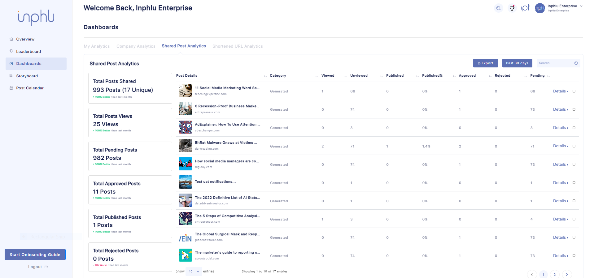
As you share posts with other Inphlu users within your Contacts or the same Enterprise account, you'll notice the Shared Post Analytics start filling out with information about the posts you've shared.
Within the table, you'll see every post that you've shared with another Inphlu user and a breakdown of what that post was, what category/kind of post it was, if the recipient(s) have viewed or have yet to view it, if the recipient(s) approved or rejected it or if they left it pending if the post has been published (if it got approved), and what percentage of users published it vs. it was shared with. These different counts will automatically fill out as the user(s) you shared it with begin to interact with the shared post.
Note: If you are still looking for all the posts you shared for the month, check to see if there's another page by looking at the bottom right corner of the table.
Tip: You can expand the table so that there aren't only ten posts on display by default by changing the dropdown in the bottom left corner of the table to increase the number of entries allowed to be in the table at one time.
As the different counts begin to add up, you'll notice the totals on the side begin to fill out as well, so you'll be able to see what the combined totals are for most of the counts for the past 30 days. Also, within the Total counts, you can see how you're stacking up for the past 30 days compared to the 30 days before, thanks to the performance indicators below each total count.
By default, a filter is put in place so that you can only see the posts you shared that are scheduled for today and the past 30 days. Suppose you would like to change this filter around or completely remove it. In that case, you can do so by clicking the Past 30 days button and selecting a new range of dates to change the analytics around to reflect a certain time or by clicking the clear option to look at all of your previously shared posts and their combined total counts.
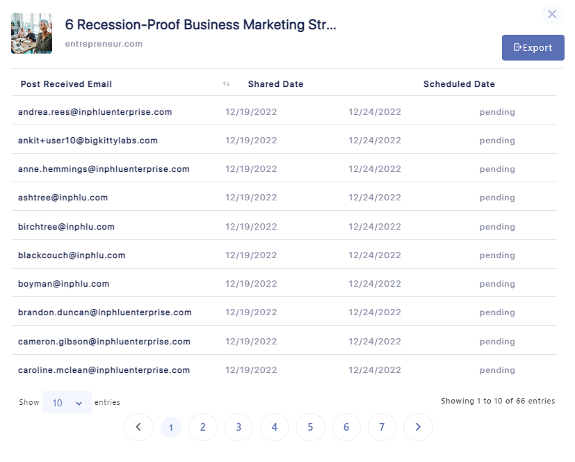
Instead of looking at the analytics for all the posts you've previously shared, you should take a closer look into a particular shared post, which is something else you can do in the Shared Post Analytics!
If you would like to take a deeper dive into your posts, you can click the Details + text on the far right side for any post and then get a pop-up giving a breakdown of the users you shared the post with, when you shared it with them, when it was scheduled, and if they approve or rejected it or left it pending.
As you may have noticed, there are a few Export buttons around the Shared Post Analytics. You can export all of the analytics within the Shared Post Analytics by clicking the Export button at the Top of the table. If you would like to export the analytics for a certain time period, you can filter out the Shared Post Analytics to reflect a certain time period and then click the Export button. If you want to export the analytics for only a few select posts, you can check the posts you like to export and then click the Export button. Lastly, if you would like to export the analytics for just one shared post, you can either do the method above or you can click the details of the shared post and click the Export button within the pop-up.
Tip: If you're searching for one particular shared post, you can search for it using the search bar in the top right of the table.
Tip: If you want to sort through your Shared Post Analytics quickly, you can click the Top of a column to help change the order.
Shortened URL Analytics
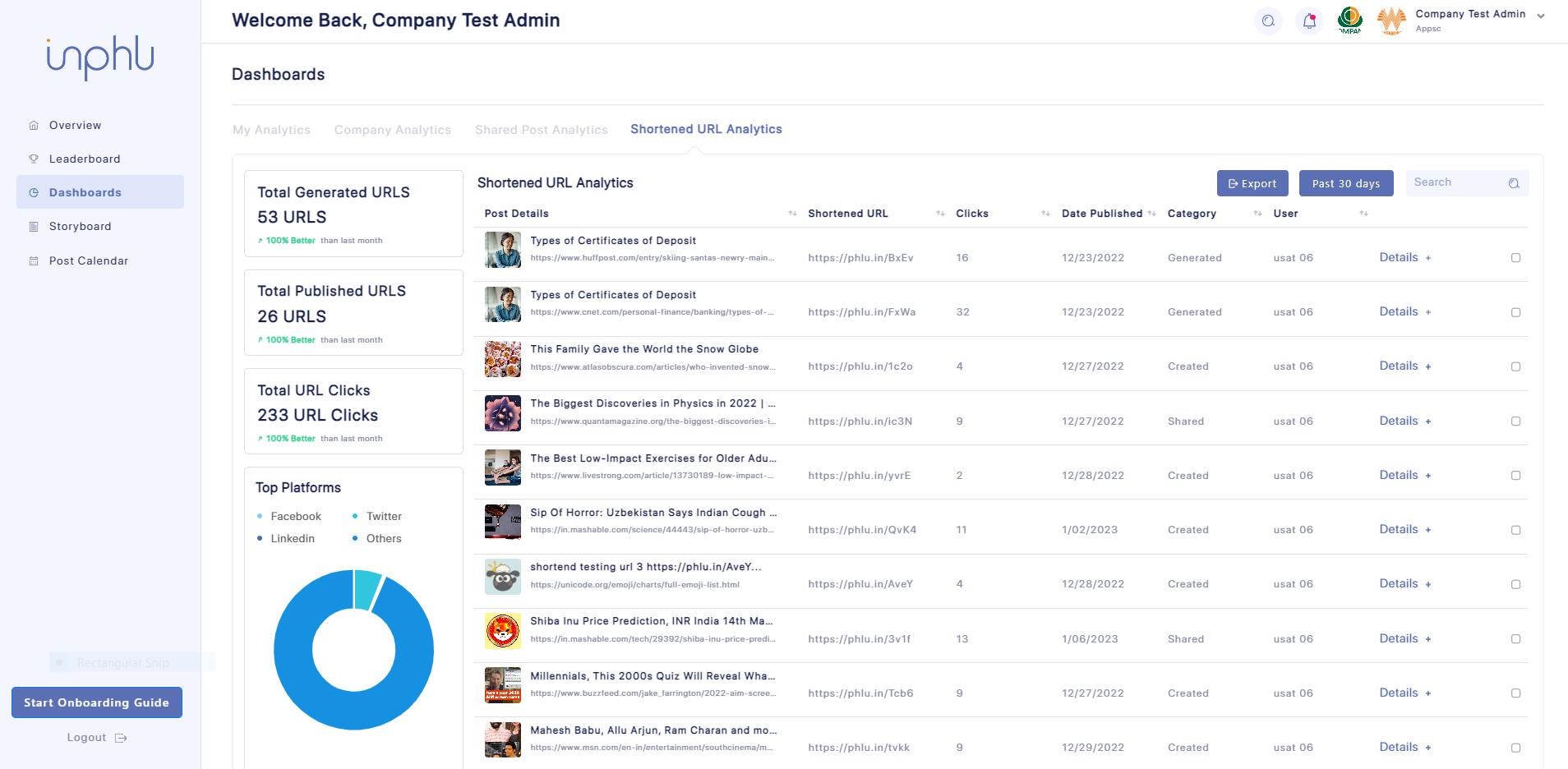
The Shortened URL Analytics, like Shared Post Analytics, show you all the posts you've shortened URLs in. In the table, along with seeing the posts you shortened URLs in, you can see what the original URL looked like, what the shortened URL looks like, how many clicks the shortened URL got, when the post got published, what type of post it is, and what user it originally came from.
The Total Counts cards and Top Platforms graph on the side of the page breaks down the shortened URLs even further:
- Total Generated URLs - how many shortened URLs have been generated
- Total Published URLs - how many shortened URLs have been published
- Total URL Clicks - how many clicks your published shortened URLs have gotten
- Top Platforms - the social media platforms that your shortened URLs have gotten the most clicks on
Note: If you are still looking for all the posts you shared for the month, check if there's another page by looking at the bottom right corner of the table.
Tip: You can expand the table so that there aren't only ten posts on display by default by changing the dropdown in the bottom left corner to increase the number of entries allowed to be in the table at one time.
Similarly to the Shared Post Analytics, as the different counts begin to add up, you'll notice the totals on the side begin to fill out as well, so you'll be able to see what the combined totals are for most of the counts for the past 30 days. Also, within the Total counts, you can see how you're stacking up for the past 30 days compared to the 30 days prior to that, thanks to the performance indicators below each total count.
Once again, by default, there's a filter put in place so that you can only see the posts that you shared that are scheduled for today and the past 30 days. Suppose you would like to change this filter around or completely remove it. In that case, you can do so by clicking the Past 30 days button and either selecting a new range of dates to change the analytics around to reflect a certain time or clicking the clear option to look at all of your previously shared posts and their combined total counts.
As you may have already noticed, there are a few Export buttons around the Shortened URL Analytics. You can export all of the analytics within the Shortened URL Analytics by clicking the Export button at the Top of the table. If you would like to export the analytics for a certain time period, you can filter out the Shortened URL Analytics to reflect a certain time period and then click the Export button. If you would like to export the analytics for only a few select posts, you can check the posts you like to export and then click the Export button.
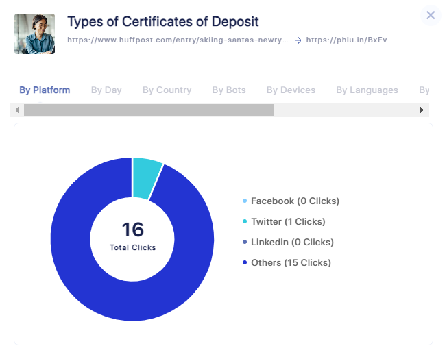
Also, if you would like to take a deeper dive into your posts with shortened URLs, you can!
Simply click the Details + text on the far right side for any post and then get a pop-up giving a breakdown of every possible piece of analytics you would like to know about the shortened URLs. Here's what each of the sections in the pop-up mean:
- By Platform - which social media platforms your shortened URLs get clicked on
- By Day - which days your shortened URLs get clicked on
- By Country - which countries the people are from that clicked on your shortened URLs
- By Bots - which bots clicked on your shortened URLs
- By Devices - which devices were used to click on your shortened URLs
- By Languages - which languages the people speak that clicked on your shortened URLs
- By Referrals - which referral links were used in your shortened URLs
- By Brands - which brands the devices that were used to click on your shortened URLs
- By OS - which operating systems were used on the devices used to click on your shortened URLs
- By Browser - which browsers people were using when they clicked on your shortened URLs
Tip: If you're searching for one particular shortened URL post, you can search for it using the search bar in the top right of the table.
Tip: If you want to quickly sort through your Shortened URL Analytics, you can click the Top of a column to help change the order.
Feel like you've got a good grip on the different analytics provided through Inphlu? If not, that's okay; you can go through this article again or start trying out the analytics yourself to get a better understanding of them!
Once you feel comfortable with the Dashboards tab, head to the next tab, the Leaderboard/My Achievements tab!